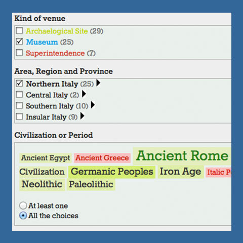
Exploratory metrics and visualization
Some demos of metrics and visualization strategies for exploratory user experiences, based on a dataset of about one hundred venues of archaeological interest in Italy.
Author: Luigi Spagnolo, Ph.D. student (spagnolo at elet.polimi.it)
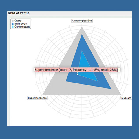
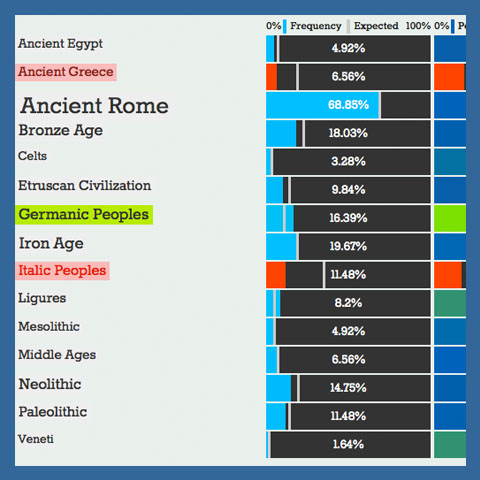
1. Understanding the context with radar and bar charts
Comparing the number of results for a given features (current count) with the intial count (all the items with that feature in the dataset) and the query count.
Metrics are visualized with a radar chart (for the type of venue facet) and with a bar chart (for the civization and period facet).
2. Frequency vs. peculiarity with confidence measures
Combining communication-oriented visualization (coloured weighted lists) with analytical view (bar charts). Confidence measure is used for esteeming the strength of the association rule between the query $q$ and each concept $C$.
Frequency (text color): how much a certain feature $C$ is diffuse among the items whose features match the query $q$
Peculiarity (background color): how much a certain feature $C$ is more likely to appear among the items matching the query $q$ rather that in other contexts of exploration (disjoint queries).
When statistically significant, the correlation between each civilization/period and the other features of archeological venues is shown in green if it is positive, in red if it negative.
3. Frequency vs. peculiarity with conviction measures
Showing correlations between the query and each concept with colours in the tag cloud. Conviction measure is used for esteeming the strength of the association rule between the query $q$ and each concept $C$.
Frequency (text color, $\textrm{conviction}(q \to C)$): how much a certain feature $C$ is diffuse among the items whose features match the query $q$
Peculiarity (background color, $\textrm{conviction}(C \to q)$): how much a certain feature $C$ is more likely to appear among the items matching the query $q$ rather that in other contexts of exploration (disjoint queries).
The correlation between each civilization/period and the other features of archeological venues is shown in green if it is positive, in red if it negative.
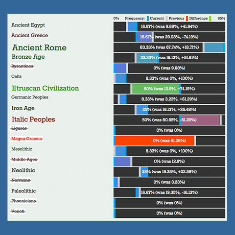
4. Visualizing exploration changes
Understanding how the computed measures (e.g. relative frequency of concepts) change while exploring the collection of items, appling or removing new filters can help user in individtuating interesting correlations among features
Frequency difference with respect to the previous query $q_{n-1}$
Differences are be displayed with coloured terms, as well as -- for deeper analysis -- with bar charts. More in detail, bar charts can dislay increase/decrease only, or compare the previous measured value with the current one
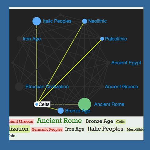
5. Displaying correlations between concepts
Displaying correlations between pairs of concepts belonging to the same facet using a graph. The size and color of edges is computed according to the lift measure of each pair of concepts $C$ and $D$:

The original application
A prototype for the Directorate-General for Antiquities of the italian Ministry of Culture